10 Beginner Website Mistakes You’re Probably Making Right Now

Updated January 24, 2020
Businesses online and offline should know about the importance of having a website. Nevertheless, the chances are you are making mistakes right now and you don’t even know about them. We are going to show you what mistakes you may be making and how to correct them. No technical expertise necessary!
See Also: 4 Ways Your Site Could Be Driving Your Audience Away
1. Lack of Vision
A lack of vision is dangerous. It’s not enough to simply have an online presence. Just because you build a website it does not mean that it is going to be a successful one. You need to build an online presence and have a firm purpose in mind for what you want to do with it.
What’s in a Vision?
A vision can be anything. It can be to inform, to sell, to educate, and to interact. Everything on your website should be directed towards this one goal. You want a user to arrive on your website and immediately know what it’s about.
2. Rushing to Market
You don’t want to rush to market. It’s tempting to zip through the process so you can get started, but what you really need to do is hold back for a moment. Take time to research. Look at your competitors and study what they are doing.
Being the first to market offers no real advantages here.
3. Complex Design
A successful website must be simple. It doesn’t have to be flashy. In fact, the more complex it is the more likely it will lead to confusion. Your design goal should be to enhance the user experience and nothing more.
How to Enhance the User Experience
- • Focus on simplicity.
- • Ask your users what they would like to change.
- • Put yourself in the position of a user.
- • Use color in the right way. Color should never blind or make it hard to read something.
- • Look at the navigation. Is it easy to pull information from your website?
See Also: Exploring The Psychology of Color Through Branding
4. Trendy Designs
The problem with following too many design trends is that they come and go like the wind. What’s popular now won’t necessarily be popular in a year from now. You can use specific design trends, but if you rely on them, they are going to quickly become outdated.
5. Outdated Content
It’s tempting to write lots of content and assume that’s the end of the process. This is not the case at all. Content should be updated on a regular basis in order to stay current with the latest in design. Older content sends the message that you are out of business or you lack innovation.
The same goes for your blog. Keep it updated! KnownHost provides professionally managed dedicated servers with 99.9% Uptime Guaranteed.
6. Low Quality Images
Images should always be in HD. It’s the minimum people are going to expect in this day and age. Don’t leave yourself looking amateurish by not investing in the highest quality images you can.
Getting Top Quality Images
- • Use stock images.
- • Purchase a better camera.
- • Use a professional who can both take and edit original pictures.
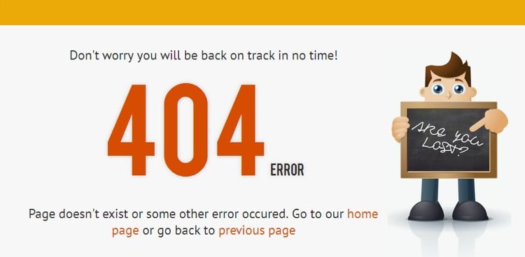
7. Broken Links/Elements
Broken links and other elements simply isn’t acceptable A 404 page is essentially a message that you’re an amateur and you’re not keeping your website updated and ready to go. It’s a bad sign.
Check your internal links on a regular basis to make sure your customers aren’t hitting a brick wall.
8. Badly Designed Logos
Your logo is your badge. It’s what will go on everything from your website to your product labelling. So why do so many companies think they can get away with a badly designed logo?
- • Don’t get your logo designed by an amateur, or worse, yourself.
- • Ask for feedback from real people.
- • Take time to think about it. This is a long-term decision.
9. Incorrect Font Choice
Determining the right font for your website isn’t difficult. It needs to compliment your design and be as clear as possible. The readability of your content relies on it.
Should You Employ a Professional?
We are not saying you need to consult a professional designer to create a font that is unique to you. However, looking at competitors and asking for feedback from a select number of customers should help with finding the right font for you.
10. Where’s Your Call to Action?
You need a call to action because you, presumably, want your visitors to do something. Websites without a call to action make your website nothing more than a business card. They have to get in touch with you to find out what you want them to do.
Tell them what you want them to do on every page. Make it clear!
Last Word
Our last word is that these ten points are the basis of what any good website should be built on. There’s nothing advanced or groundbreaking on this list, but it explains why so many businesses fail. They don’t get their website in order and they are shocked when customers don’t respond well to them.
Employ a professional web designer today to look your website over and see where you can improve!